Using well-designed graphics can simplify findings and increase the impact of an evaluation report. Many evaluation reports have a required format, so it may not be possible to use graphics. When creating presentations or writing reports without a designated format, consider how representing data with graphics can increase the accessibility of the data being presented.
Tips for Using Graphics
- Choosing the right graphic depends on the type of data
- Line graphs can be used to represent one or more categories of data over time and are good for showing the level of difference between two categories, two groups, or change over time
- Bar graphs can be used to represent one or more categories of data, represent change over time, and show differences between categories or groups
- Pie charts can be used to present categories as part of the whole
- Good graphics are accurate representations and do not visually distort data
- Good graphics lead to a better understanding of an evaluation
- Graphics need to be appropriate for the intended audience
Line Graphs
- Enter data into columns (make sure not to leave spaces between columns)
- Highlight the cells with the data to be included in the line graph
- Click insert on the ribbon banner and choose the line graph option from the chart menu
- Format the line graph according to desired appearance
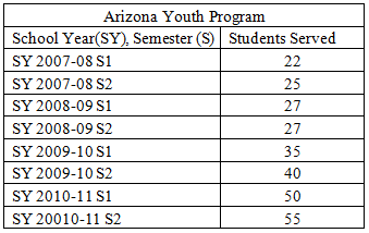
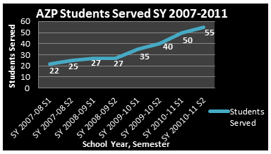
| Data in numeric form only: | Same data in a line graph: |
| 
|
Bar Graphs
- Enter data into columns (make sure not to leave spaces between columns)
- Highlight the cells with the data to be included in the bar graph
- Click insert on the ribbon banner and choose the bar graph option from the chart menu
- Format the bar graph according to how you want the graph to appear
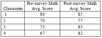
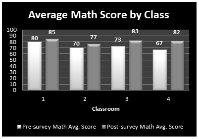
| Data in numeric form only: | Same data in a bar chart: |
| 
|
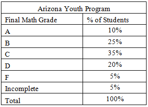
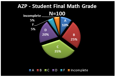
Pie Charts
- Enter data into columns (make sure not to leave spaces between columns)
- Highlight the cells with the data to be included in the pie chart
- Click insert on the ribbon banner and choose the pie graph option from the chart menu
- Format the pie chart according to how you want the chart to appear
| Data in numeric form only: | Same data in a pie chart: |
| 
|