Analyzing numeric information produces results from data. Interpreting data through analysis is key to communicating results to stakeholders. The type of analysis depends on the research design, the types of variables, and the distribution of the data.
This section will focus on the two types of analysis: descriptive and inferential.
Descriptive Analysis
Descriptive analysis provides information on the basic qualities of data and includes descriptive statistics such as range, minimum, maximum, and frequency. It also includes measures of central tendency such as mean, median, mode, and standard deviation.
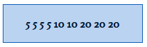
There are many ways to describe data, and descriptive analysis can describe what the data look like. Below are some common ways to describe data. Using the set of scores below, the following are examples of descriptive statistics.
Common Descriptive Statistics | Example | |
| Range | The difference between the highest score and lowest score | Above, the range is 15 (20 - 5) |
Minimum (Min) | The lowest/smallest score in a data set | Above, the minimum is 5 |
| Maximum (Max) | The highest/largest score in a data set | Above, the maximum is 20 |
Frequency | The number of times a certain value appears in a set | Above, the frequency of 20 is 3; expressed as a percentage, the score 20 appears 33% of the time |
Measures of Central Tendency
The measures of central tendency can give a snapshot of how participants are responding in general. These measures include mean, median, and mode.
| Measures of Central Tendency | Example | |
| Mean | The average or the sum of the values divided by the number of values | Above, the mean is 11.1 (5+5+5+5+10+10+20+20+20)/9) |
Median | The middle score of data when set in numerical order. To find the middle position, order the scores, count the number of scores, add 1, and divide by 2 | Above, the median is 10 |
| Mode | The most frequently occurring score in a data set | Above, the mode is 5 |
Standard Deviation
When we think about how participants are responding in general (e.g., mean, median, mode), we also need to consider how far apart or close together participants’ responses are. To understand more about the nature of the data, you can consider standard deviation.
As a measure of how close the scores are centered around the mean score, standard deviation shows how well the mean represents all of the data. A standard deviation represents the average amount that a given score deviates from the mean score.
Inferential Analysis
Once the data have been appropriately described, inferences can be made based on that data.
Inferential analysis uses statistical tests to see whether an observed pattern is due to chance or due to the program or intervention effects. Research often uses inferential analysis to determine if there is a relationship between an intervention and an outcome as well as the strength of that relationship.
This section provides an overview of things to consider before starting inferential analysis, examples of common statistical tests, and the meaning of statistical significance.
One of the first steps in inferential analysis is to answer the question what does the distribution of data look like? The type of test used will be guided by the distribution of the data. Distributions fall into two categories: normal and non-normal. The distribution of data should always be checked before beginning inferential analysis.
Normal Distribution
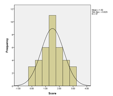
This type of distribution looks like the Bell Curve. The graph below is an example of what a normal distribution looks like.
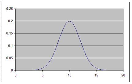
Looking at the distribution, a curve could be drawn over it that would fit the data. If the distribution looks like the one in the image below (or close to it), it is normal. This type of distribution shows that the majority of the data is clustered around one number or value. Usually if the data is normal, statistical tests called parametric tests are used.
Non-Normal Distribution
There are several ways a distribution can be non-normal; a small sample size or unusual sets of responses are common causes of non-normal distributions. Usually if the data is non-normal, statistical tests called non-parametric tests are used.
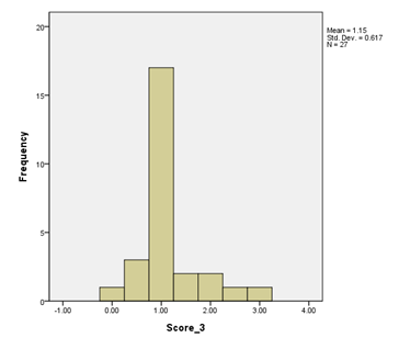
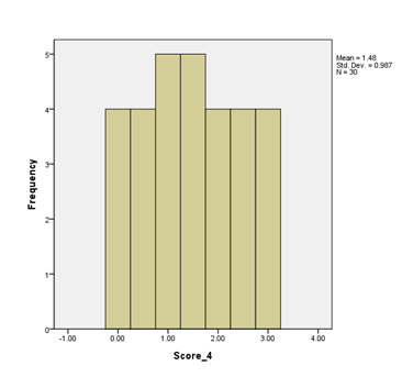
Skewed
This type of distribution does not take the shape of the familiar Bell Curve and can be skewed positively or negatively.
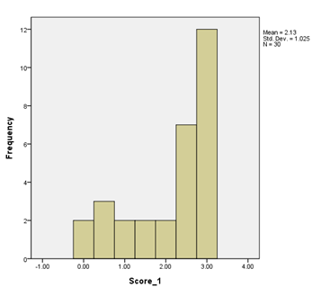
Negatively Skewed
The bar chart below shows negatively skewed data; the majority of the scores are at the higher end of possible scores.
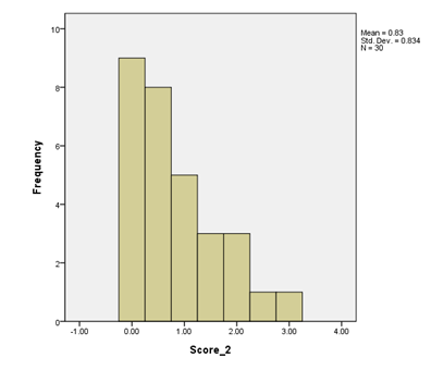
Positively Skewed
The bar chart below shows positively skewed data; the majority of the scores are at the lower end of possible scores.
Kurtosis
Kurtosis describes a distribution that is either too peaked (pointy) or too flat.